Client: Sixpenny
Type: Digital Design Direction, Website Design
Deliverables: UI, Development, Concept, Illustration, Design
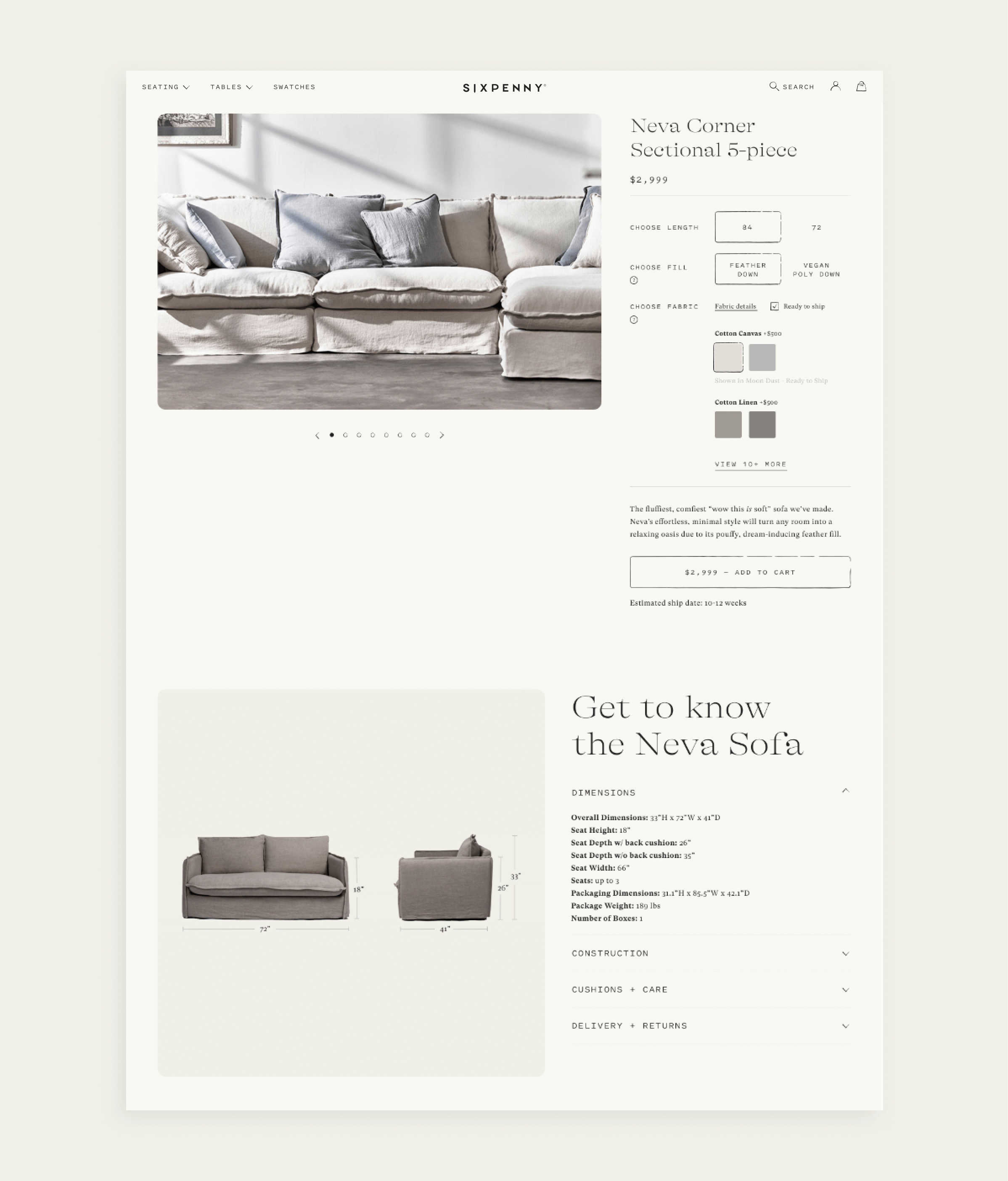
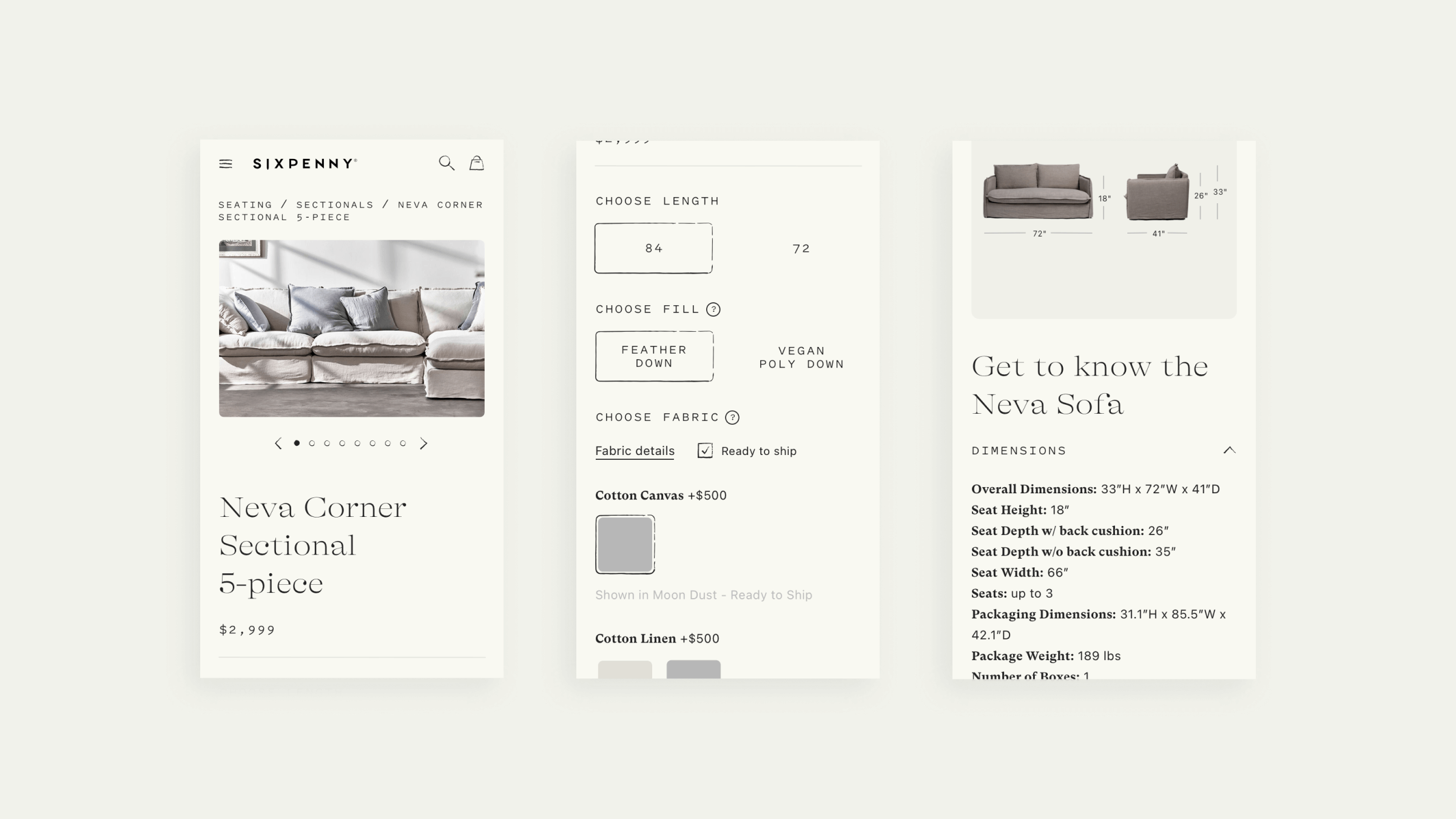
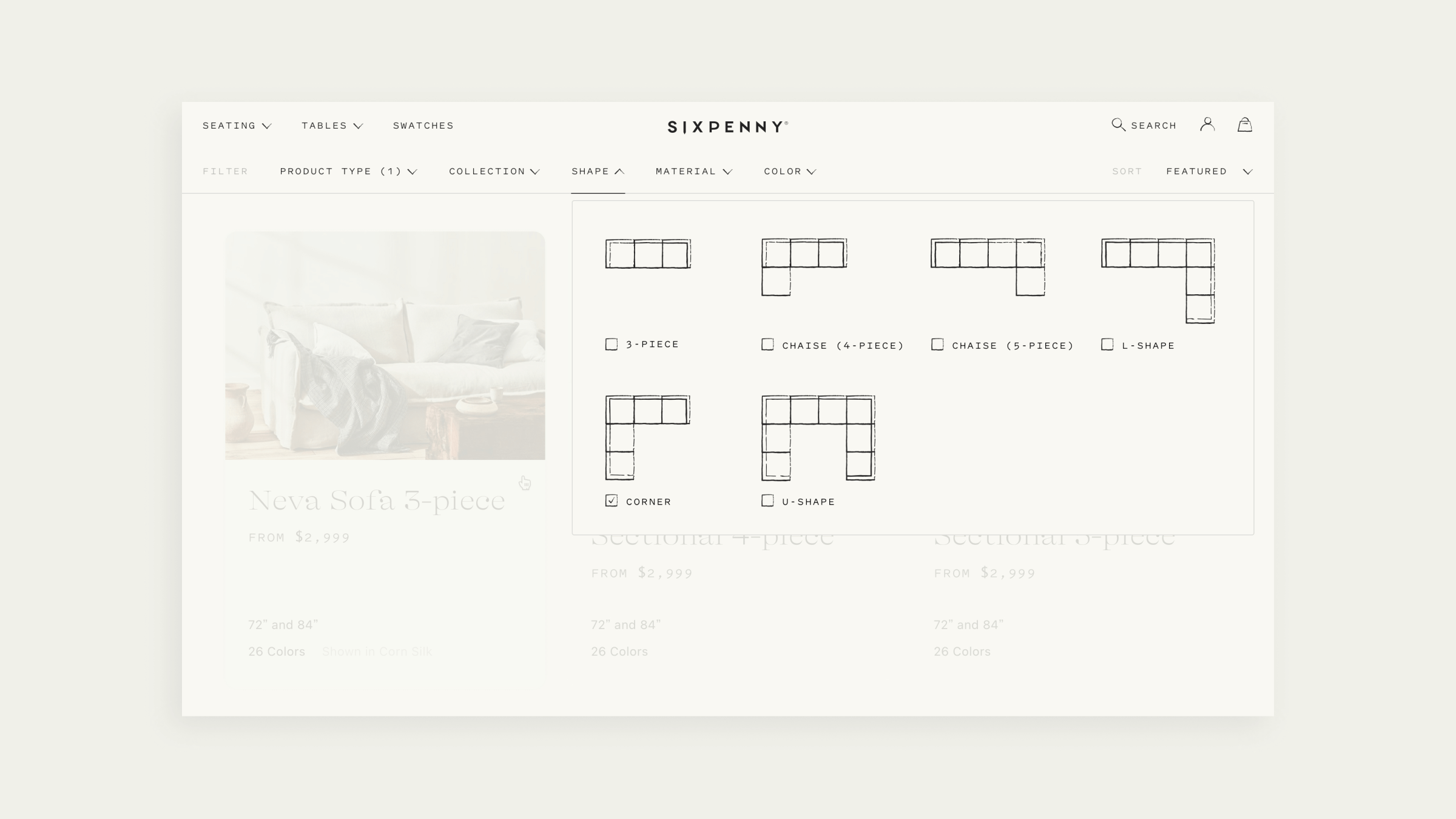
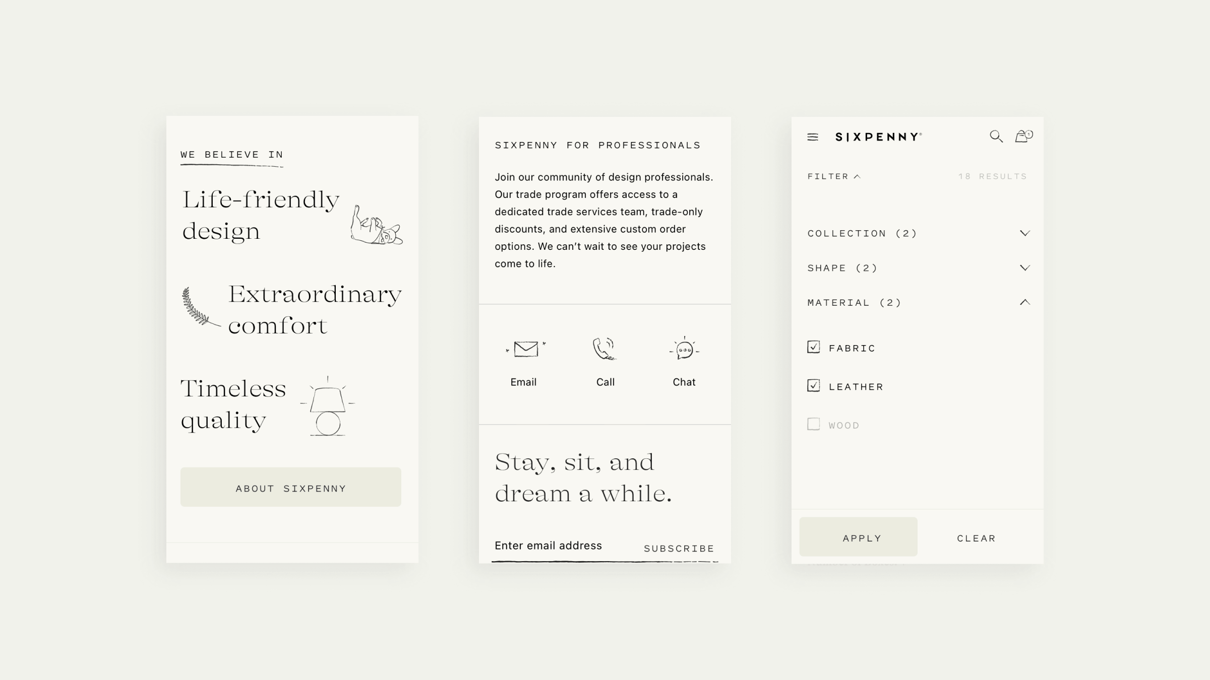
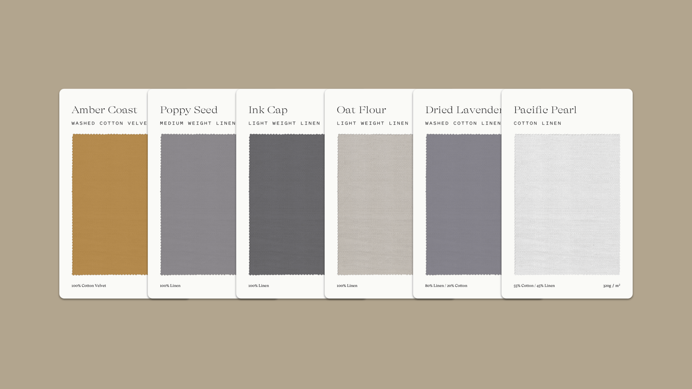
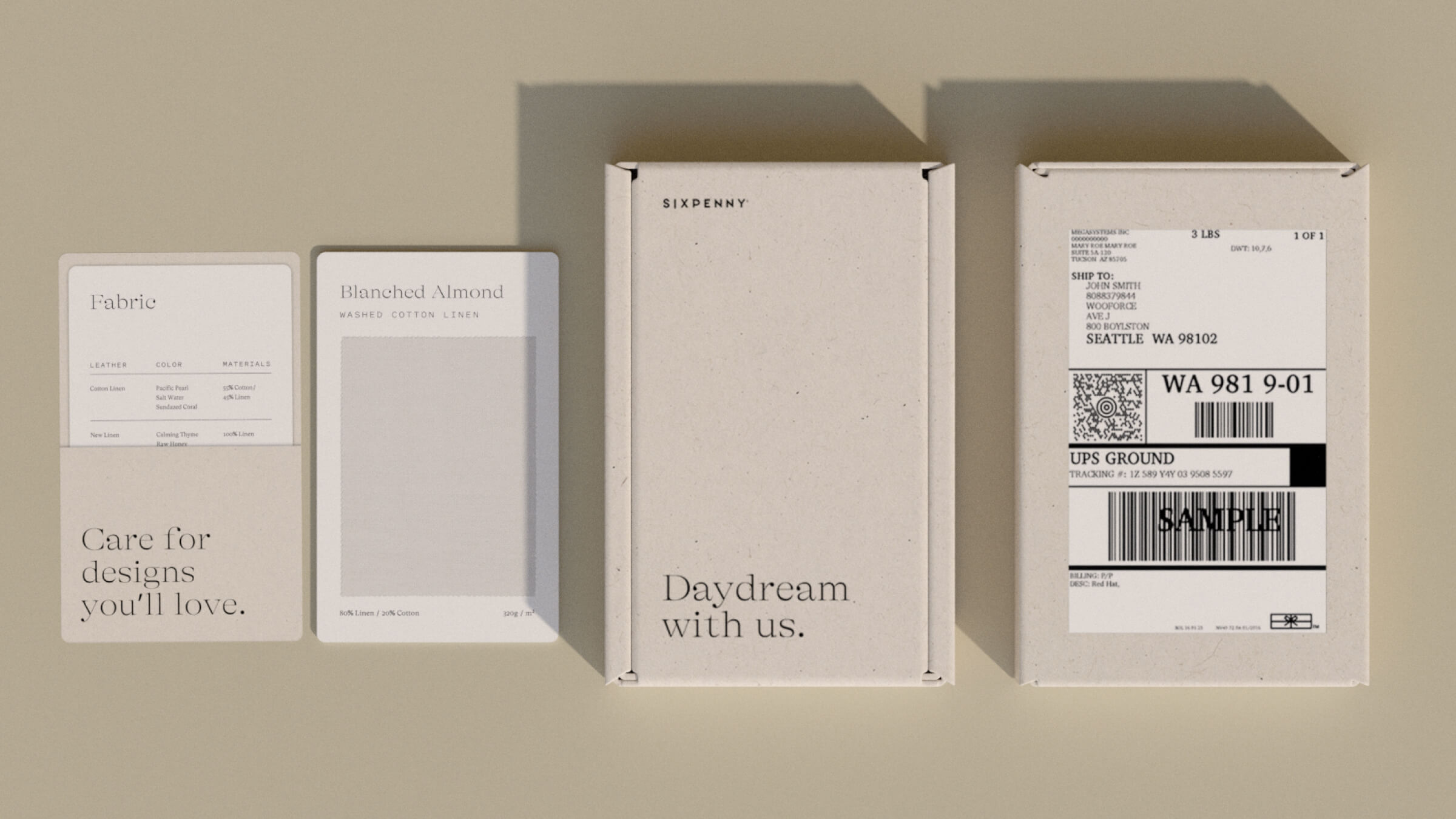
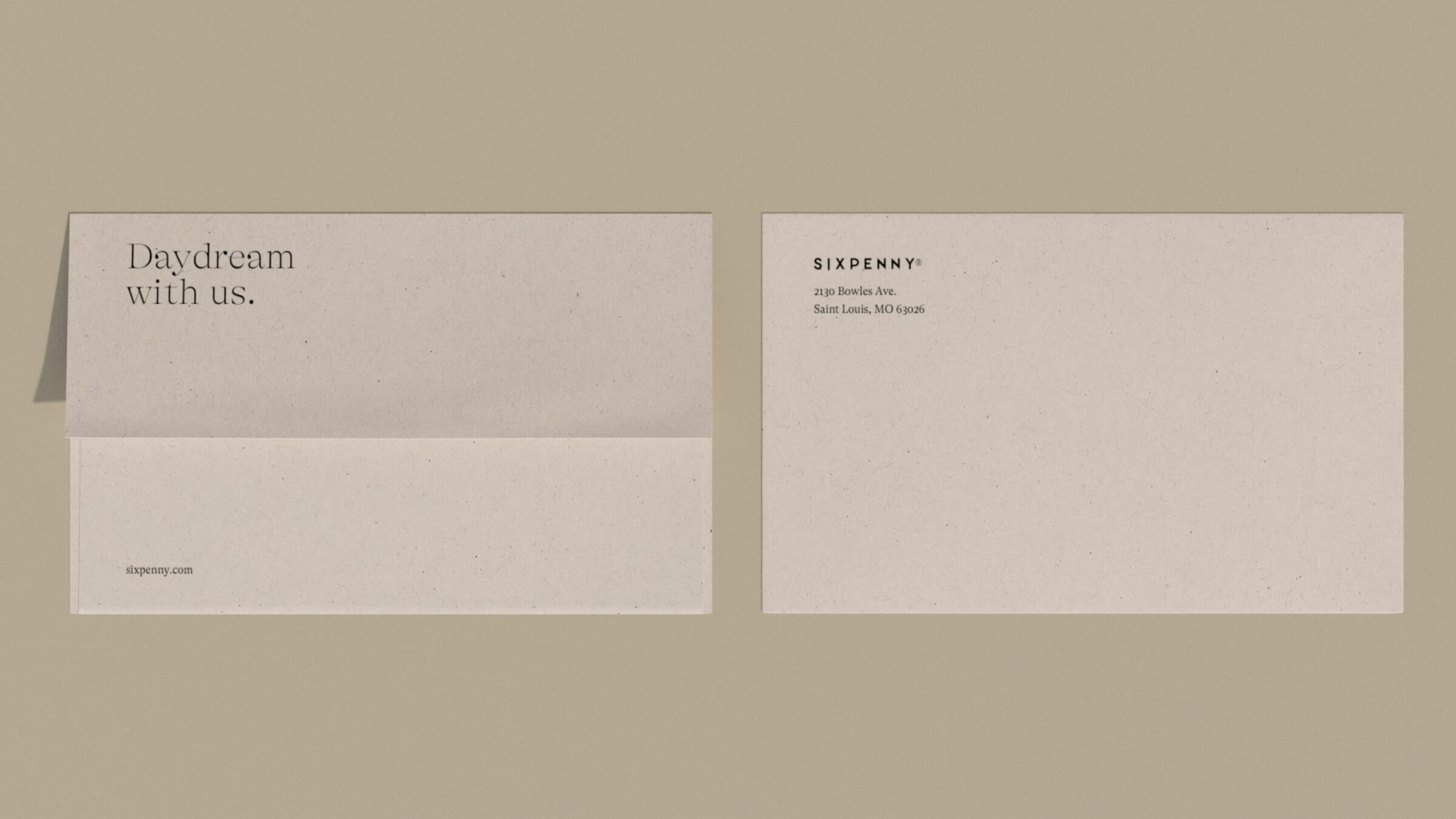
Sixpenny is a furniture company that believes in the functionality of extraordinary comfort, life-friendly design, and timeless quality. We worked on the identity refresh to relaunch Sixpenny; this included brand guidelines, new packaging, and the design and development of a unique e-commerce experience.

Italic Treatment
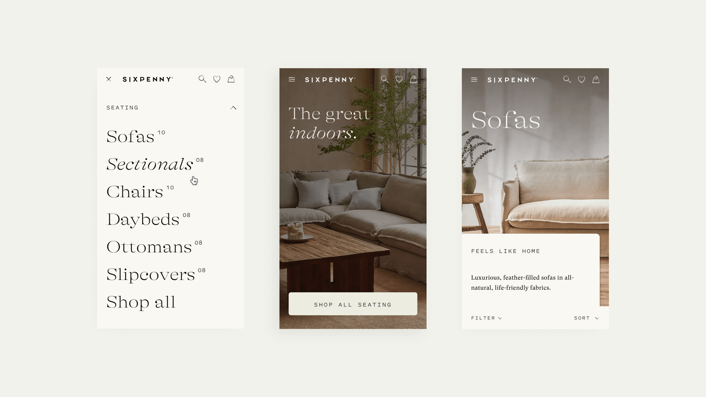
The italic treatment is an iconic aspect of the identity refresh. We used it to evoke a sense of past and present and to accentuate copy and phrases used throughout the site.
Custom Illustrations
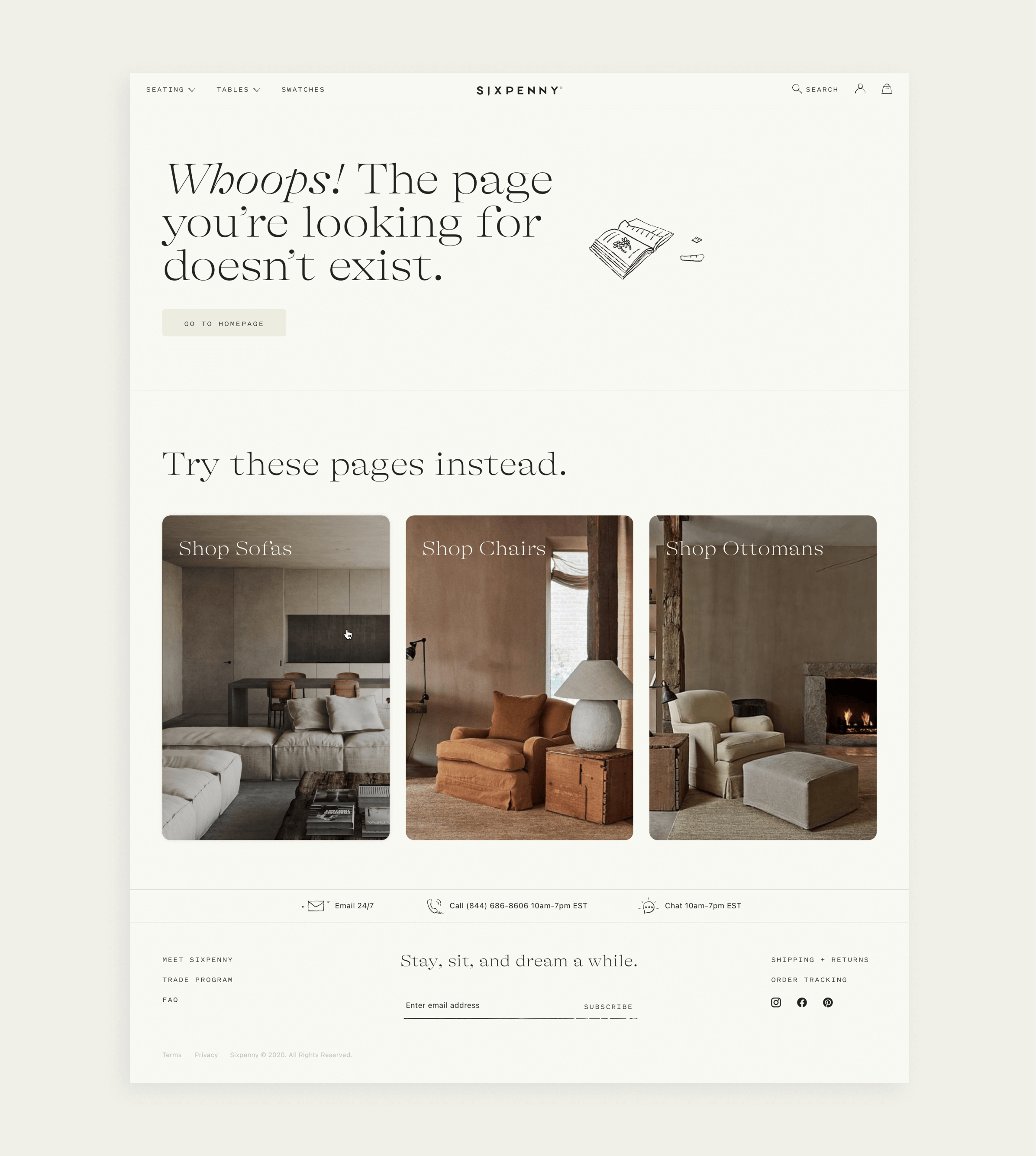
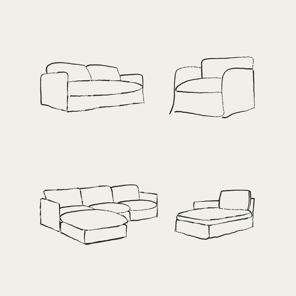
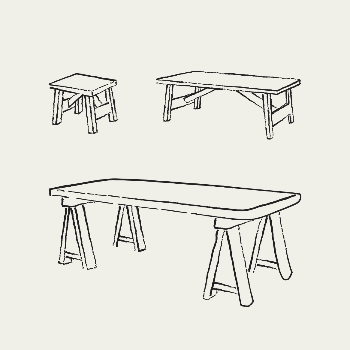
We created custom illustrations and icons to enhance the comfortable feel of the brand. We wanted to evoke the feeling of someone writing or sketching in a journal while relaxing on their Sixpenny sofa.




Credits
Creative Team: Estee Kim, Ann Suh, Lindsey Ullman and Ever Morera
Copy: Ryan Sparrow
Product Manager: Natsai Mandisodza
Development: Juan Solano
Selected Works
Wired - Amazon Prime Day 2024E-commerce

Little Yawn CollectiveE-commerce

36 Days of TypeExperimental
